Brand Guidelines
Version 1.0

Brand Guidelines
Version 1.0
Updated 2023/05/23
This is a visual identity manual for the TITANS brand. Its purpose is to ensure that the brand’s visual communication is consistent across all online and offline channels. It serves as a guideline for TITANS employees all around the world, as well as all for external suppliers. Anyone contributing to the preparation of visual materials must comply with the rules introduced in these guidelines.
Like the brand, the manual itself needs to be regularly updated and adapted to new needs to fulfil its role as a tool for creating new or modifying existing visual formats in the long run.
The manual was prepared by Büro Milk.
Here is an overview of the individual elements that make up our brand. Think of them as tools in your brand toolkit.

Logo
Our logo is the primary expression of our brand. It should feature prominently in all internal and external communications.

Colours
Colour plays an important role in brand recognition. We have selected a set of primary and secondary TITANS colours.
Typography
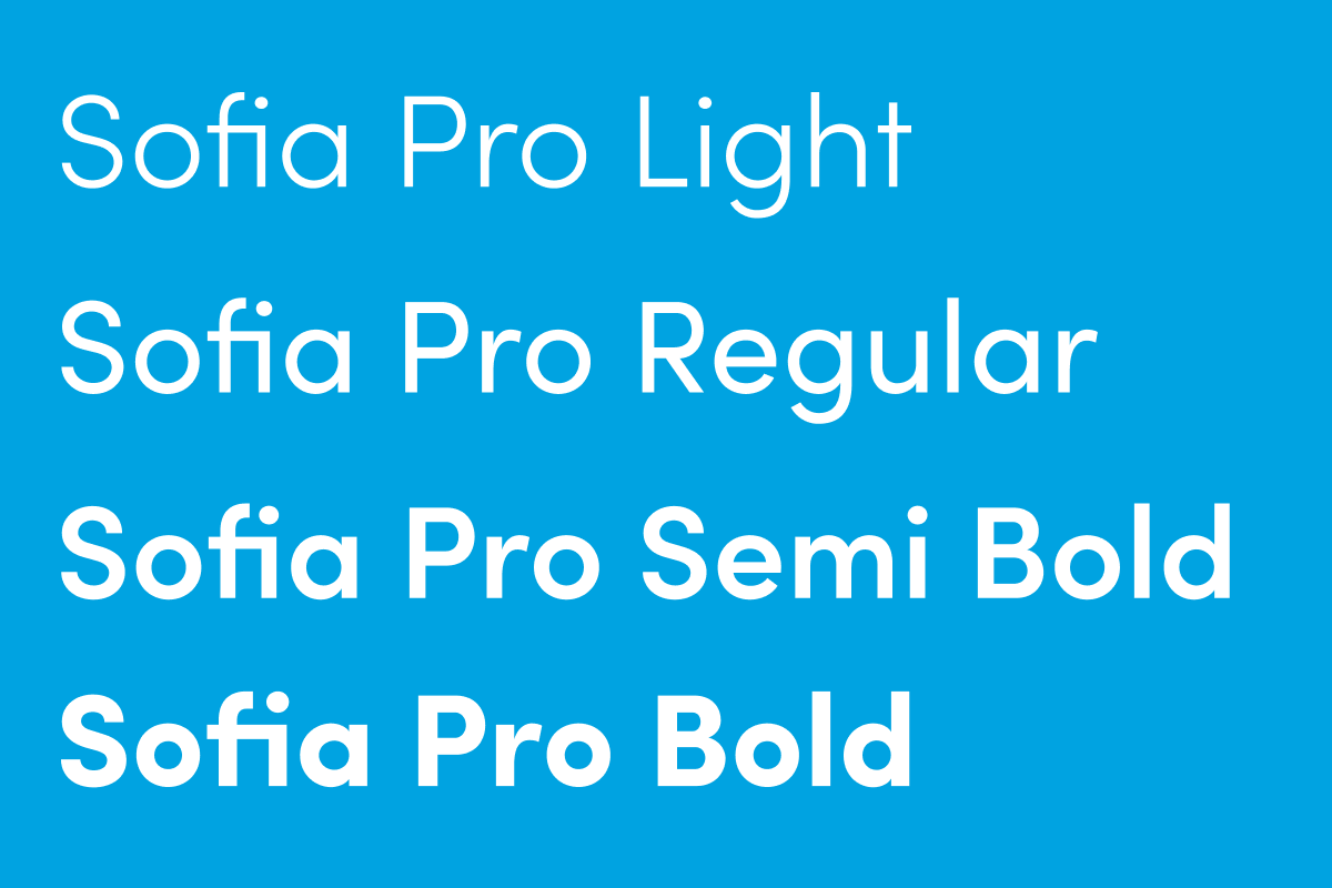
The primary brand typeface is Sofia Pro. It helps to strengthen the brand’s look and feel and to express the brand’s personality.

Visual and illustrative style
The visual and illustrative style can be used to deliver immediate impact by separating the logo and placing it as a dynamic element within the illustration style.
Updated 2024/04/17
This is the primary TITANS logo.
Other ways of using our logo are described below. Based on the type of communication, the correct version of the logo should be chosen. For an overview of logo usage, take a look at this section.
Primary logo
Symbol with a word mark in horizontal alignment is used as our primary TITANS logo.
Symbol
The symbol can be used independently, as long as the logo is present nearby.
Vertical logo
The vertical logo can be used in specific situations, only if it’s not possible to use the horizontal logo, for example in circle or square formats.
Headquarters logo
This logo version should be used only by the Slovak headquarters. It’s historically rooted in the original communication and the vision is to be completely removed in the future.
Clear space is the zone around the logo which must not be interfered by any other element. This zone is determined by the “x”, which is ½ of height of the TITANS helmet.
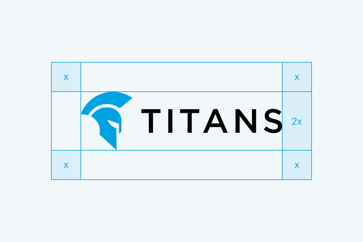
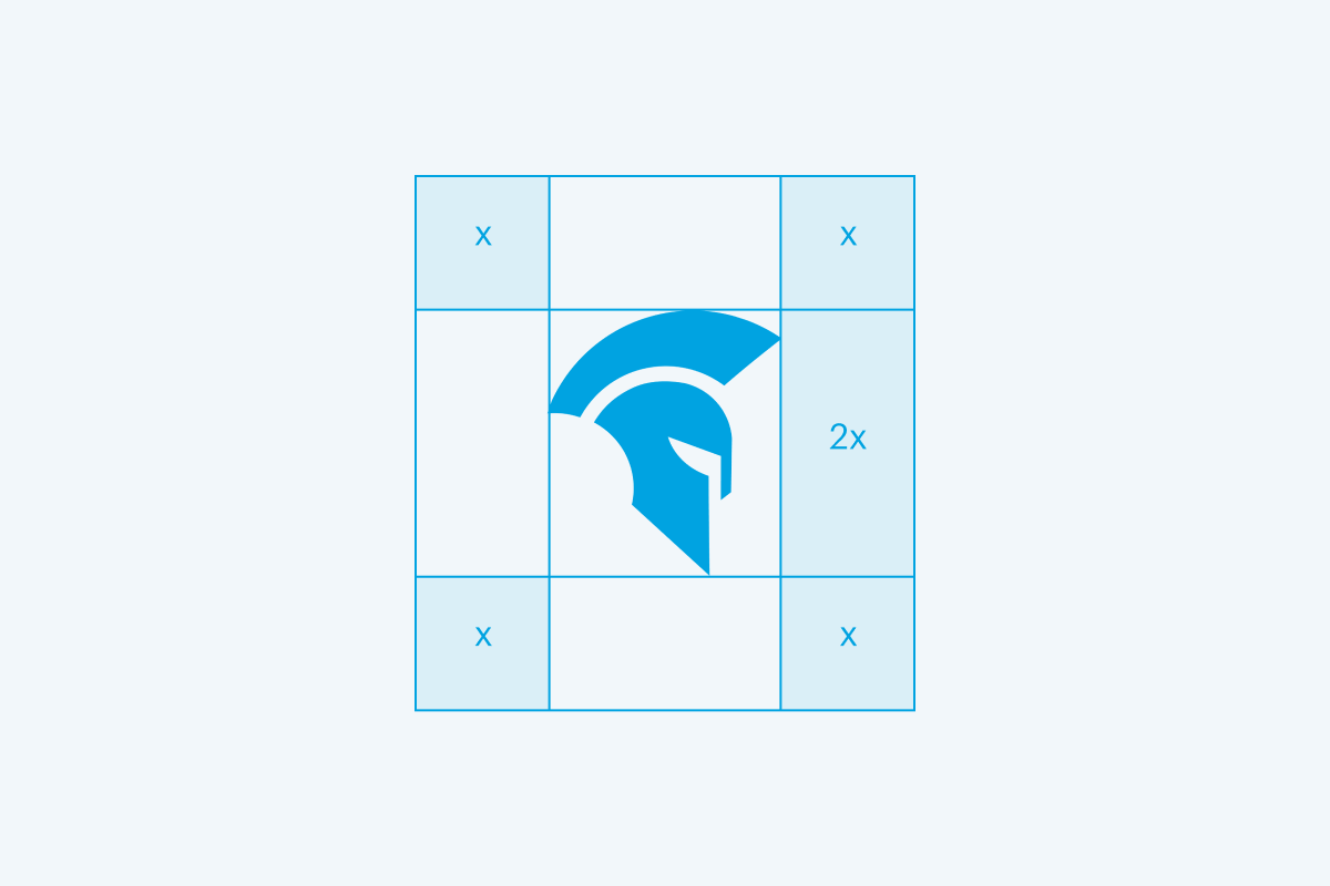
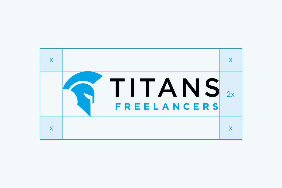
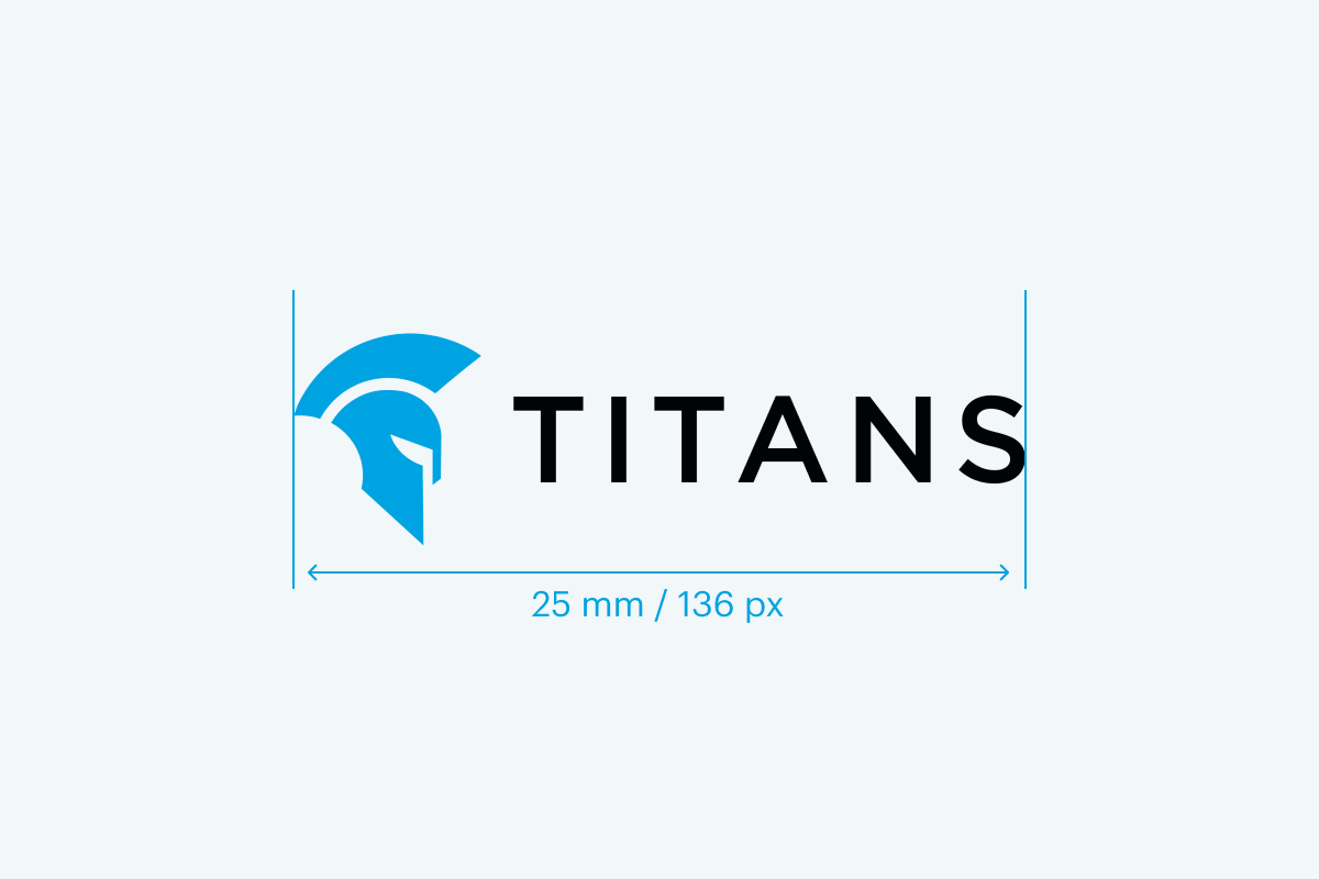
It is important that all parts of our identity can be easily read in every application. For this reason, the logo should not be reproduced smaller than the dimensions specified below. There are no maximum size restrictions as long as the clear space requirements are met.
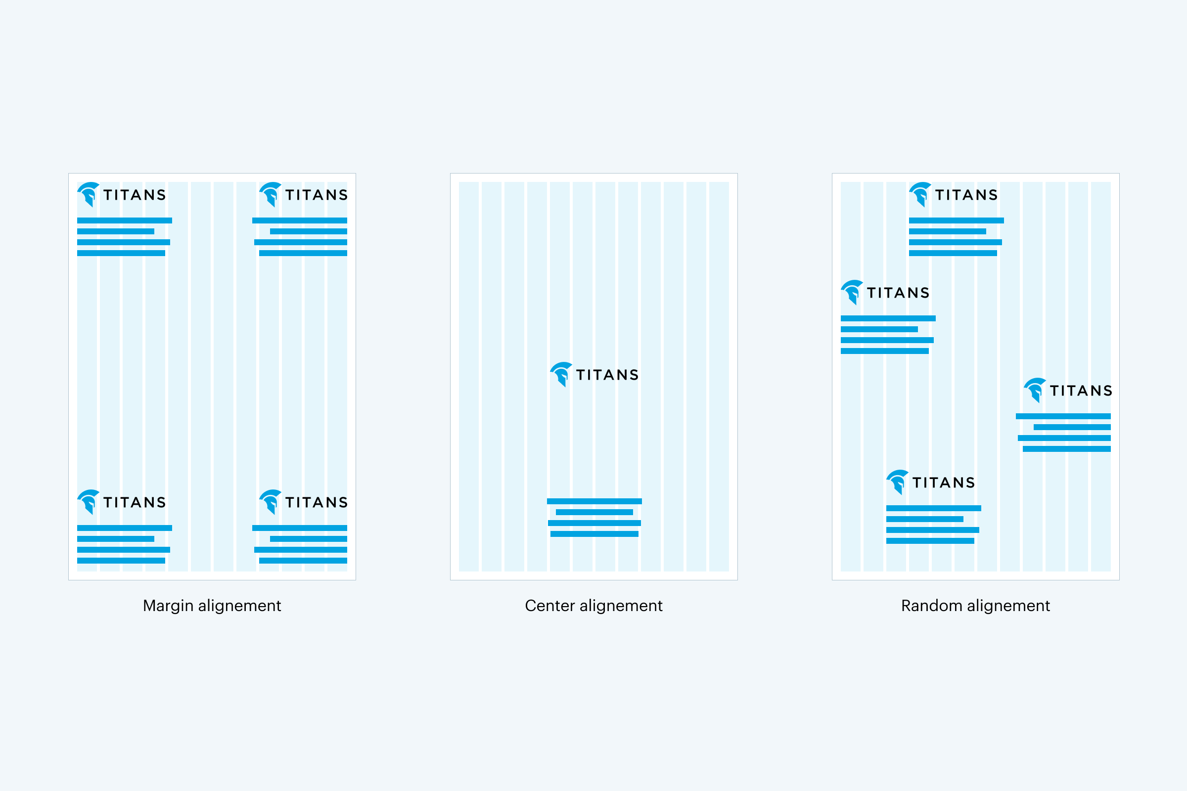
The primary position for our logo is the top left or bottom left corner, locked to the margin. However, our logo position is flexible and can respond to the content of the application. Below are examples of alternative positions for our logo.
The primary logo should always be the first choice for any design. In case it’s not possible to use it, the following alternatives are available.
The white logo is supposed to be used on Titans Blue, Titans Dark Grey and Titans Grey backgrounds.
On busy backgrounds like photography or comic illustration you can use the white logo.

The blue and white logo is supposed to be used on dark backgrounds like Titans Black or Titans Midnight.
In exceptional cases where it’s not possible to use colour, the use of the grey logo is permitted
The black logo is used only when the colour logo does not work, for example in a partners’ list on posters.

The icon with an outline or its fragment can be used in graphics as a decorative element accompanying the full logo or a written brand name.
Our logo should always be the most vital and visible element of our communications. When working with photography, the colour and placement of the logo should always be considered carefully. Always make sure that the logo is visible and readable. Stick with one colour to create contrast between the photo and the logo.
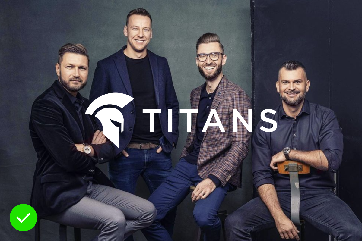
White logo on dark background

Dark or multicolour logo on dark background
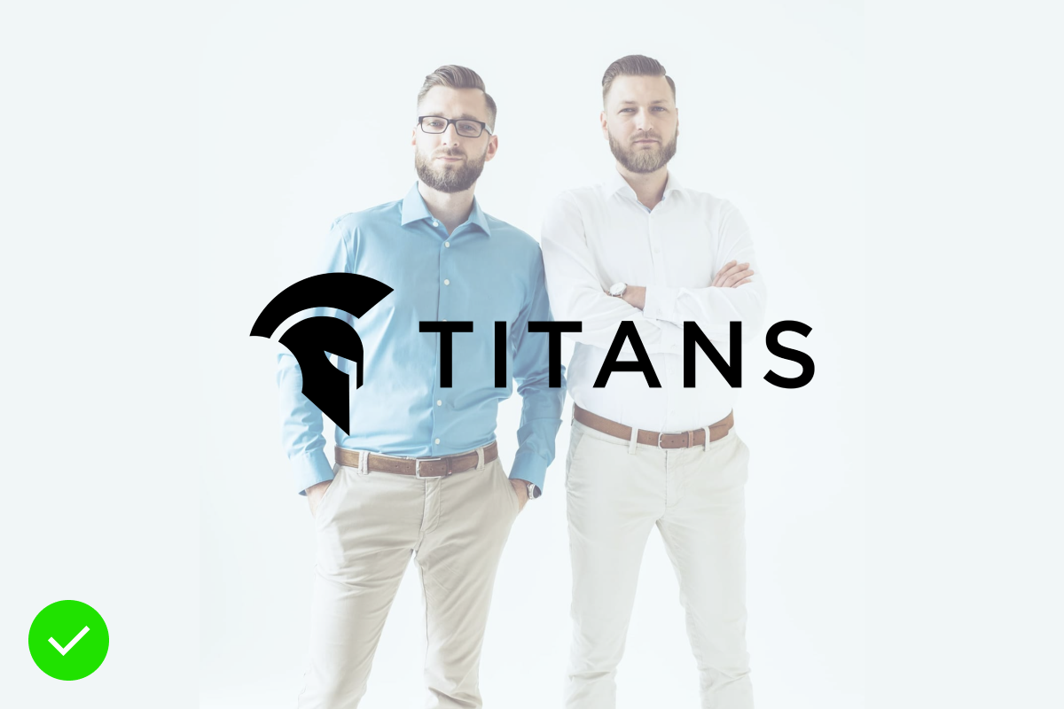
Dark logo on light background
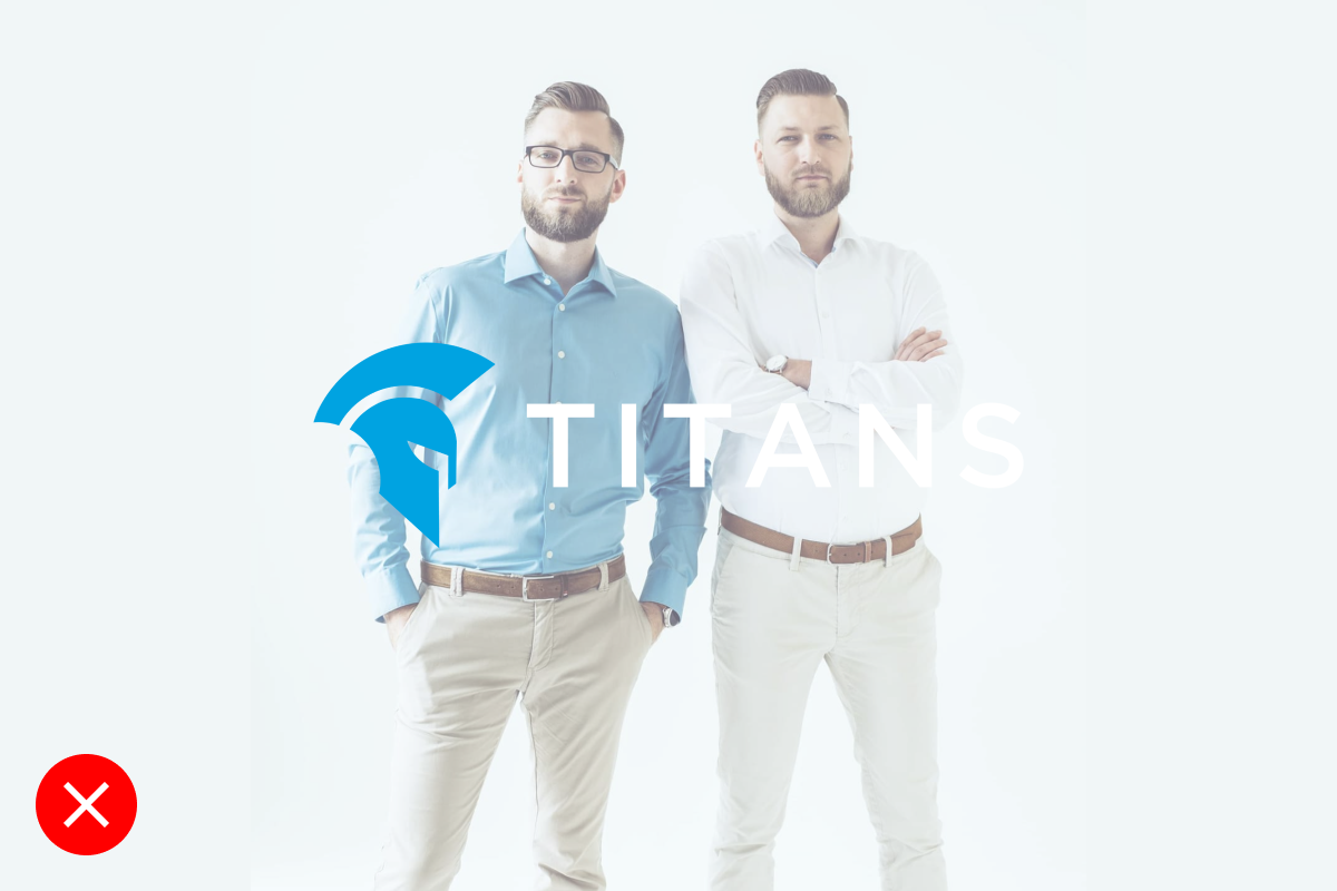
Light or multicolour logo on light background
Any misuse or alteration of our logotype affects the integrity of our brand. Please always use the approved logo artwork to ensure design consistency.
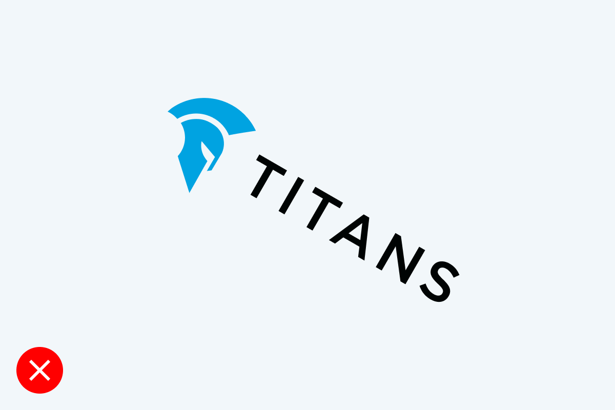
Do not rotate the logo or standalone symbol.
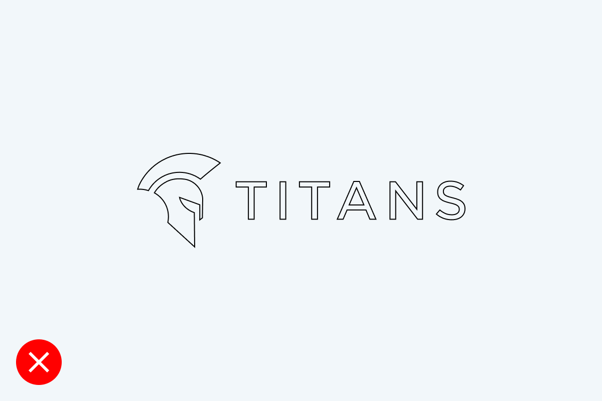
Do not use outlines on full logo.
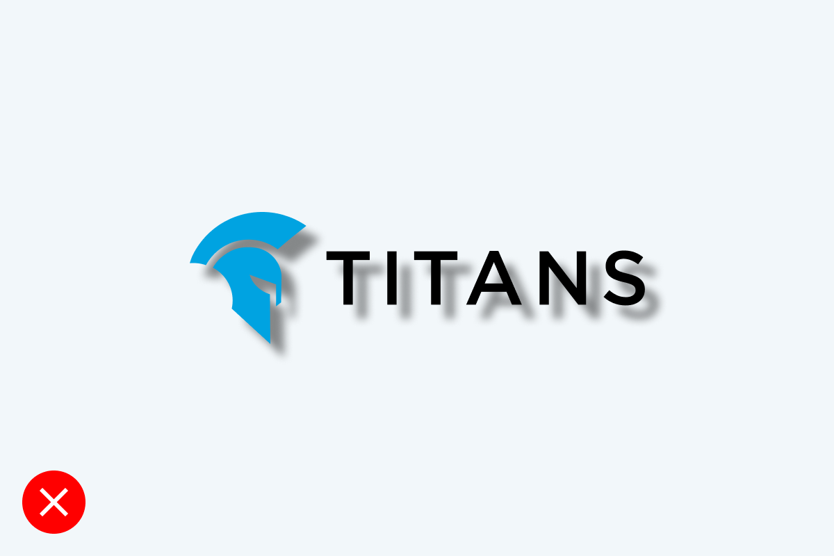
Do not add a shadow or other effects to the logo or standalone symbol.

Do not add a gradient or recolour the logo or standalone symbol.
Updated 2023/05/23
The use of colour is an important aspect of the TITANS identity. Therefore, always use the exact colour values listed below to keep the brand consistent.
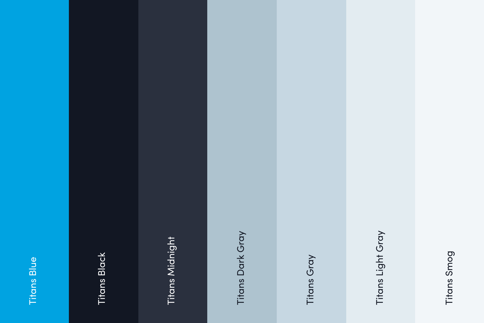
Our primary colours are Titans Blue and Titans Black.

#00a3e1
RGB 0 163 225
CMYK 82 11 0 0
Pantone 2191 CP

#121723
RGB 18 23 35
CMYK 60 40 40 100
Pantone Process Black C
Our secondary colours are Dark Blue, Light Blue, Black, Grey and Aqua as the accent colour.

#292f3e
RGB 41 47 62
CMYK –
Pantone –

#afc3cf
RGB 175 195 207
CMYK –
Pantone –

#c6d7e2
RGB 198 215 226
CMYK –
Pantone –

#e4ecf1
RGB 228 236 241
CMYK –
Pantone –

#f2f7fa
RGB 242 247 250
CMYK –
Pantone –
We can work with our primary colours by using different intensity of colour. They may be used in this way in a comic or in specific layers of the designs.

The colour palette is set to help communicate different moods. Below are the examples of how to combine the colours. Titans Blue is used in all these themes. Themes are suitable for a comic or brand graphics.

Updated 2023/05/03
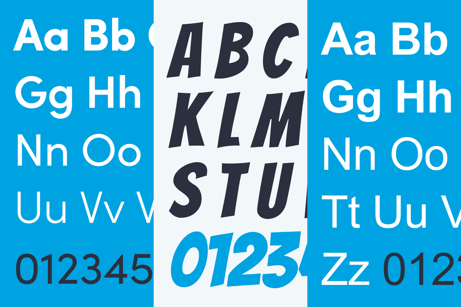
Our typography is structured for a specific visual style and occasion. In situations where we work with a comic illustration, we use additional fonts to match the aesthetics. Our typography lives in two worlds – in the real world and in the world of comic. Real World works with Sofia Pro and Comic World with Bangers.
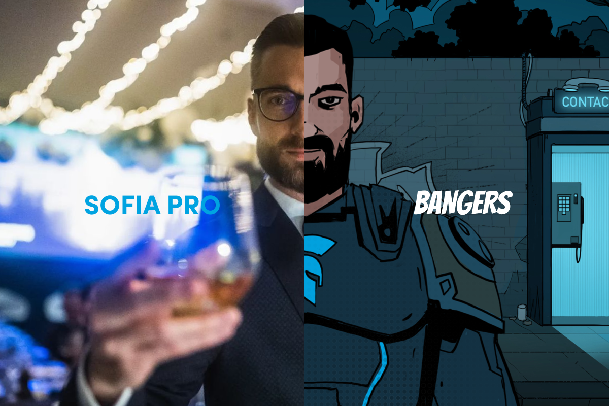
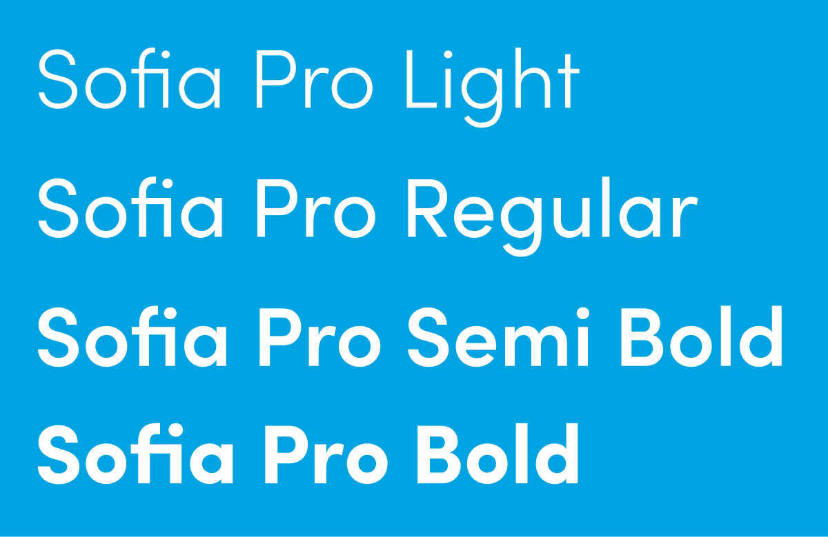
Sofia Pro is our primary font in which we set our whole communication. Both headlines and body texts are set in Sofia.
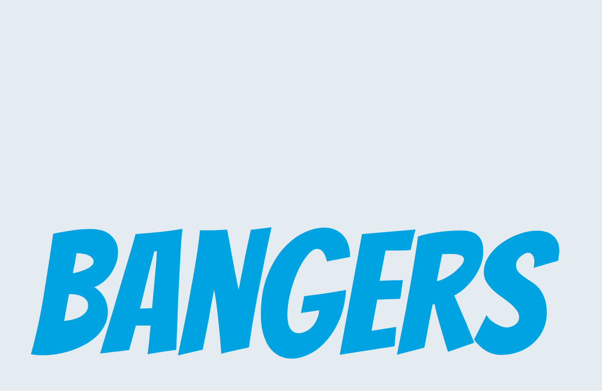
In connection with the comic, we use Bangers as our primary font for texts of narrator captions and character monologues. Stylised version could be used in subtitles. Secondary font could be used everywhere in connection with a comic illustration.
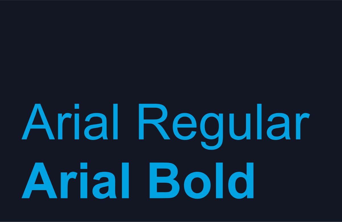
In cases where it’s not possible to use our typography, stick to Arial Regular and Arial Bold.
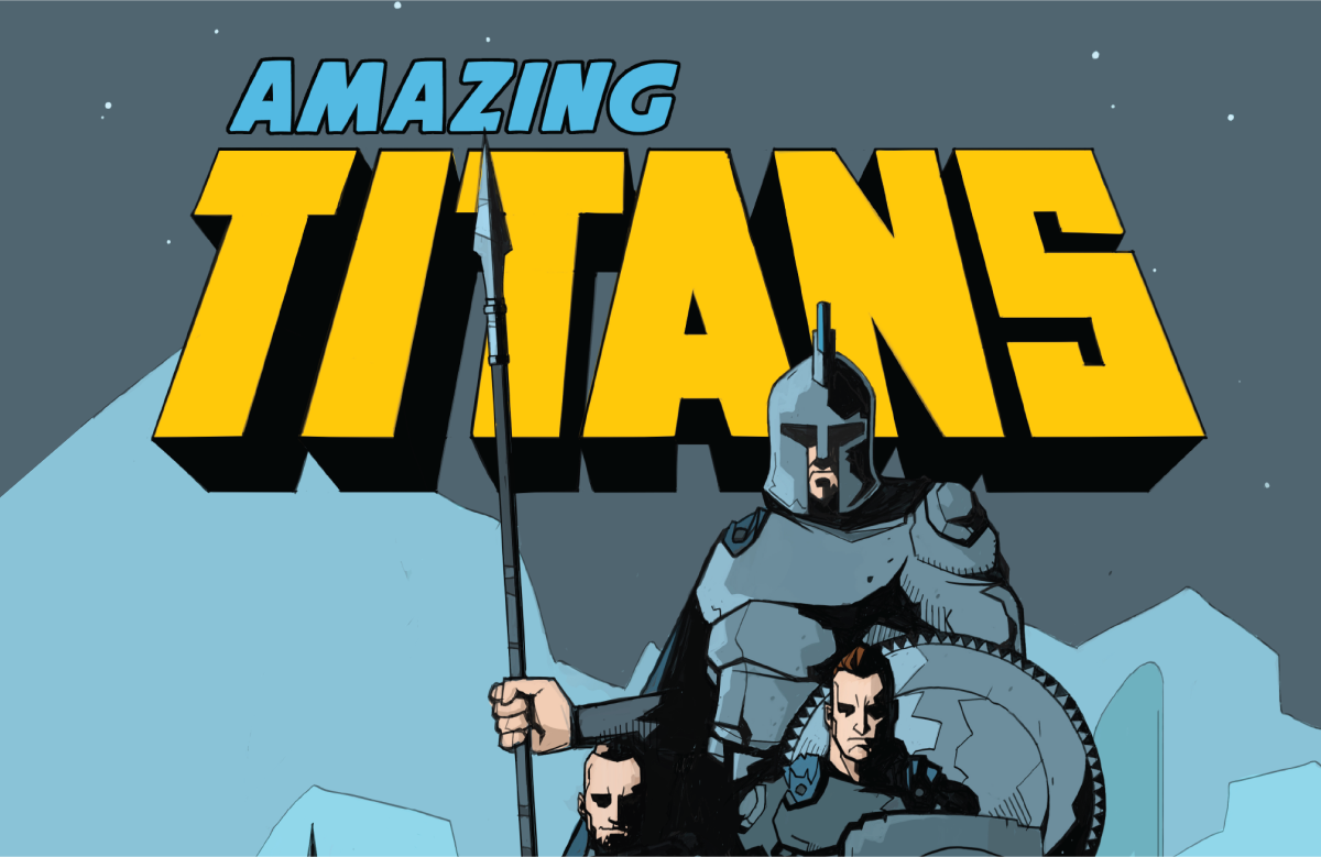
Custom comic illustration contains a custom headline accompanied with Bangers subtitle.
The primary brand typeface is Sofia Pro. We use Light, Regular, Semi Bold and Bold weight for both the headline and copy texts.

It is important to organise typography in a hierarchical system according to relative importance or inclusiveness through scale and function depending on communication.
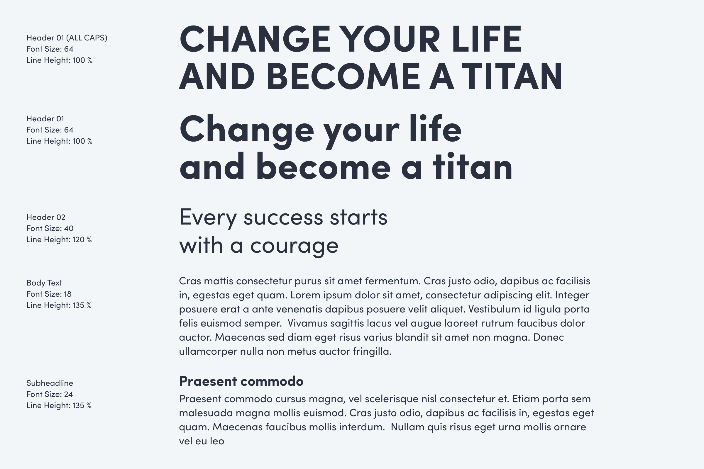
ALL CAPS headlines in Sofia Pro are a connection with Bangers used in comic world.
Always create information hierarchy
Use only Primary and Secondary colours
Use readable contrasts
Use proper line-height
Use ALL CAPS for hero headlines
Do not combine with Bangers font unless its in comic context
Do not combine with Arial
In connection with a comic, we use Bangers as our Primary font for narrator captions and character monologues. A stylised version could be used in subtitles. The Secondary font could be used everywhere in connection with a comic illustration.

Always use only in the context of a comic
Do not use for headlines
Do not use without a connection to a comic
In open e-mail communication, the brand type must be replaced with a font that is compatible with the fonts widely available to users on different devices and platforms. Typically, it is a Helvetica font (Mac), or Arial (Windows).
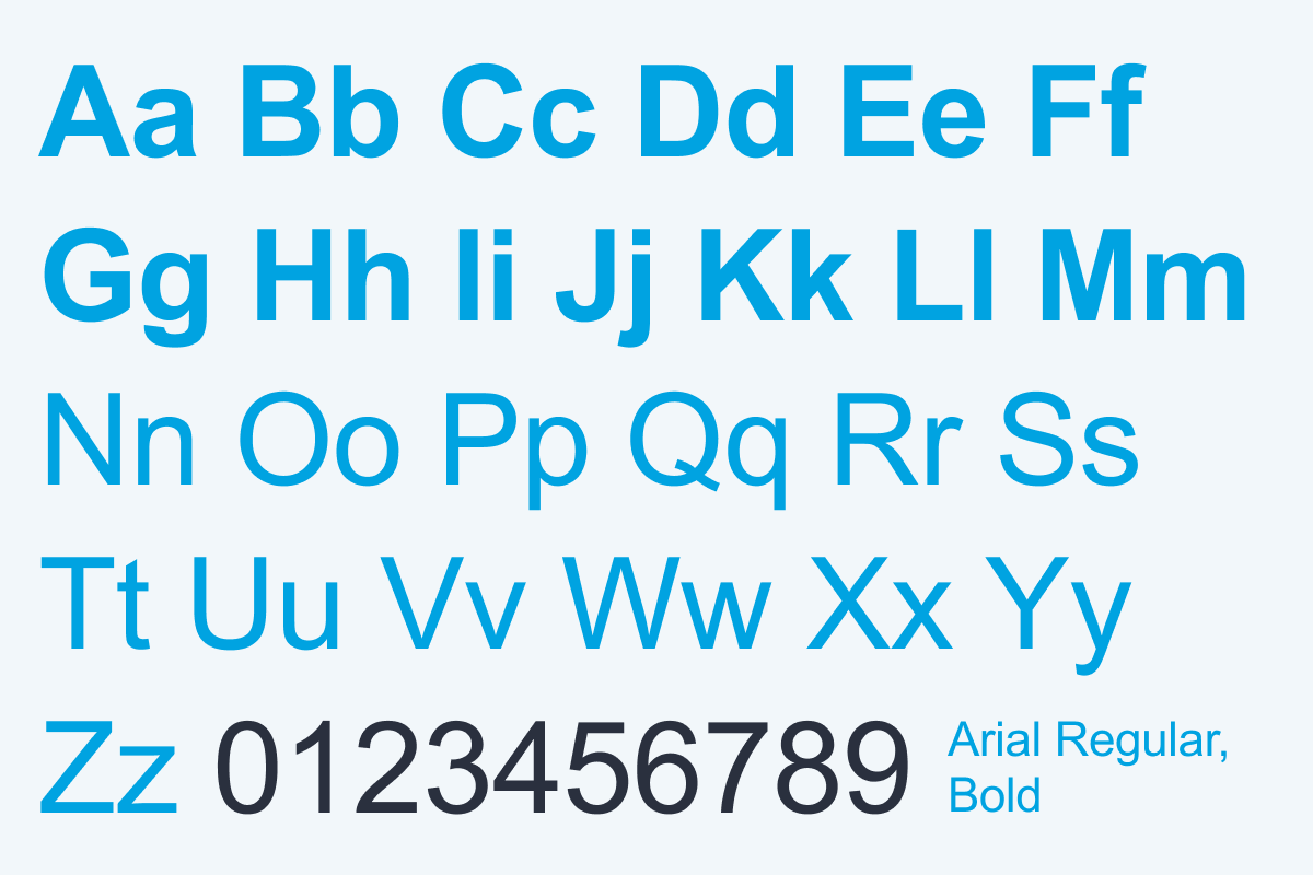
Only use as fallback typography
Do not combine with Sofia
Updated 2023/10/16
Our illustrative style varies in terms of message structure, audience and tone of voice. The illustrative style always respects colour balance and colour theme combinations in the communication. There is no special colour palette for comic illustrations. Every illustrator is free to select colours to work with, but every illustration should be in harmony with TITANS Colour Palette and use Titans Blue as the contrast colour.
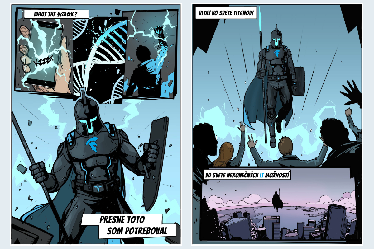

Illustration could be used separately as an illustrated background to keep illustrative world present without using characters and objects in the foreground.
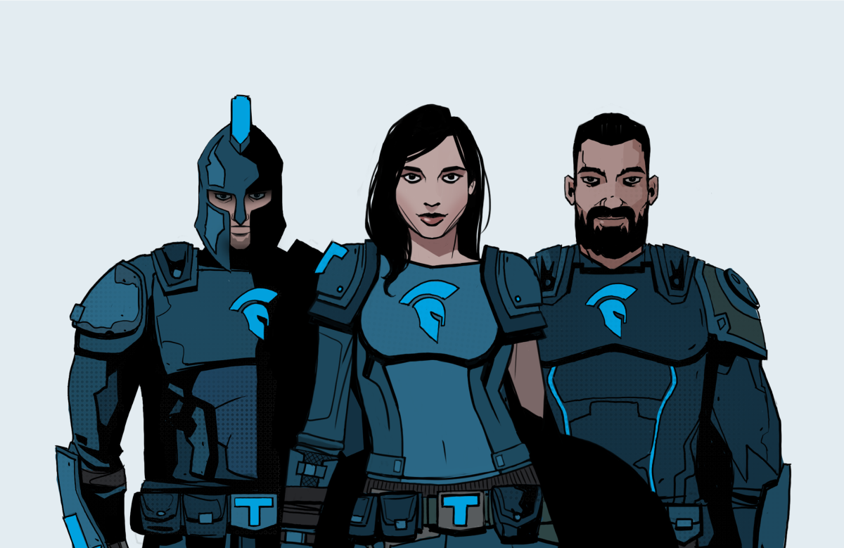
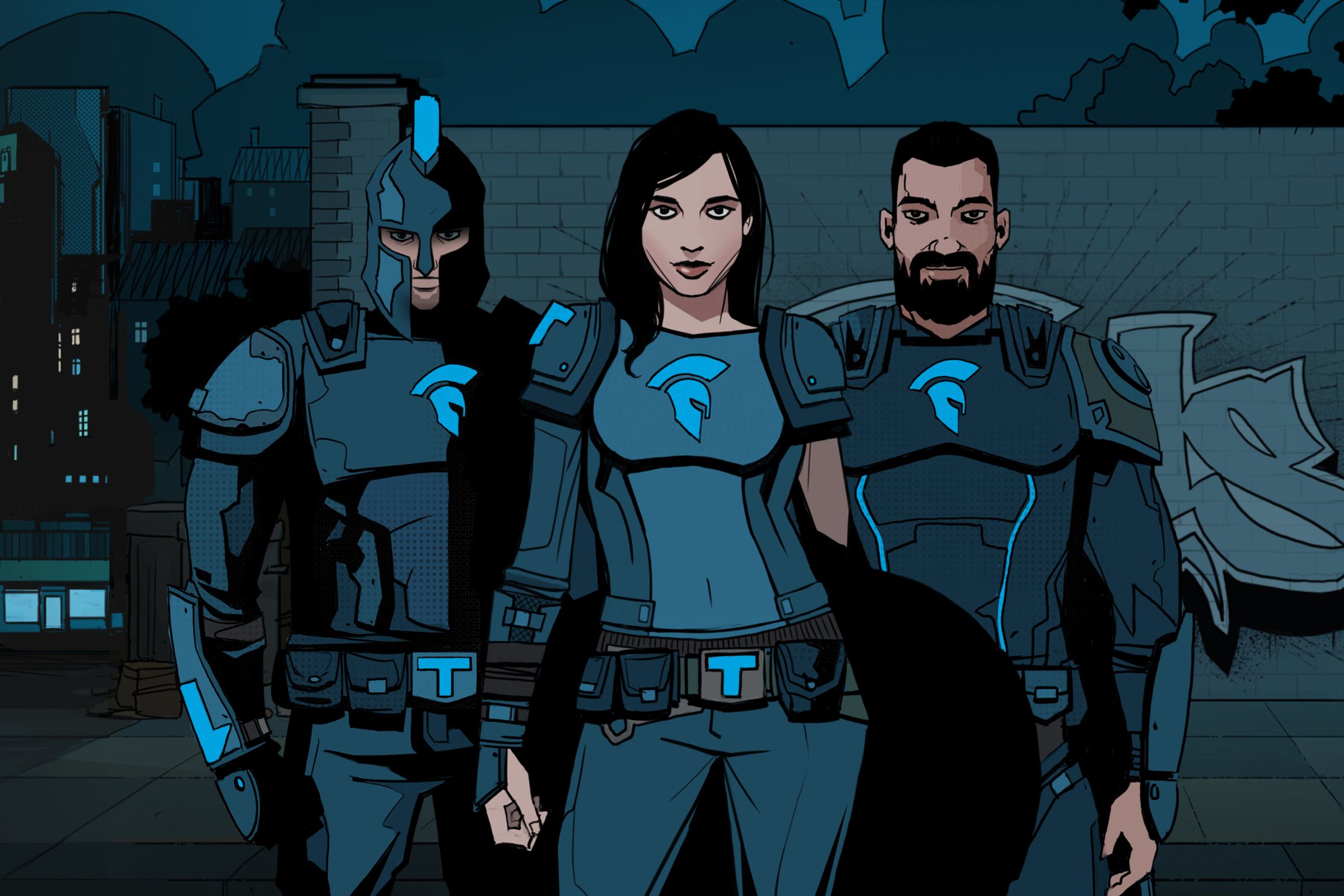
Characters are introducing the viewer to the world and tribe of TITANS and the hero potential hidden in every individual. Primarily, we depict characters with comic backgrounds.
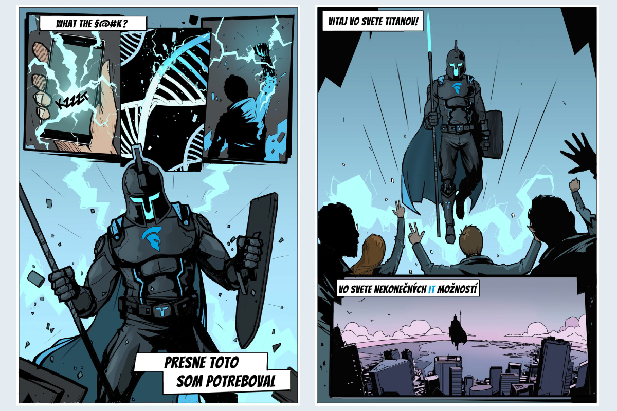
Narrator captions and monologues are placed in caption boxes and speech bubbles. They are all set in Bangers font.
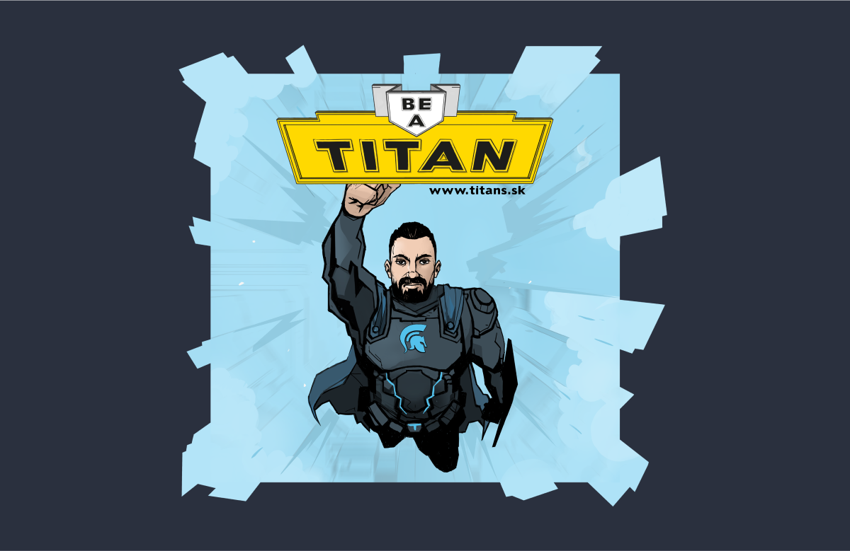
Comic can be used as a simple image in different graphics applications.
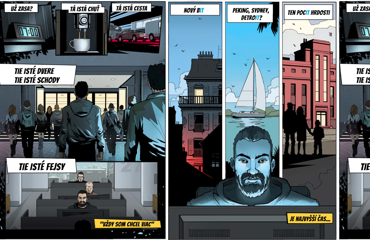
In more complex applications, we use more structured stories with more images and texts.

For infographics and campaign, we can adapt the illustration style and communicate the brand by using main brand colour.

Ideally, use comic backgrounds to place characters into the comic realm. A comic raster pattern can also be used.
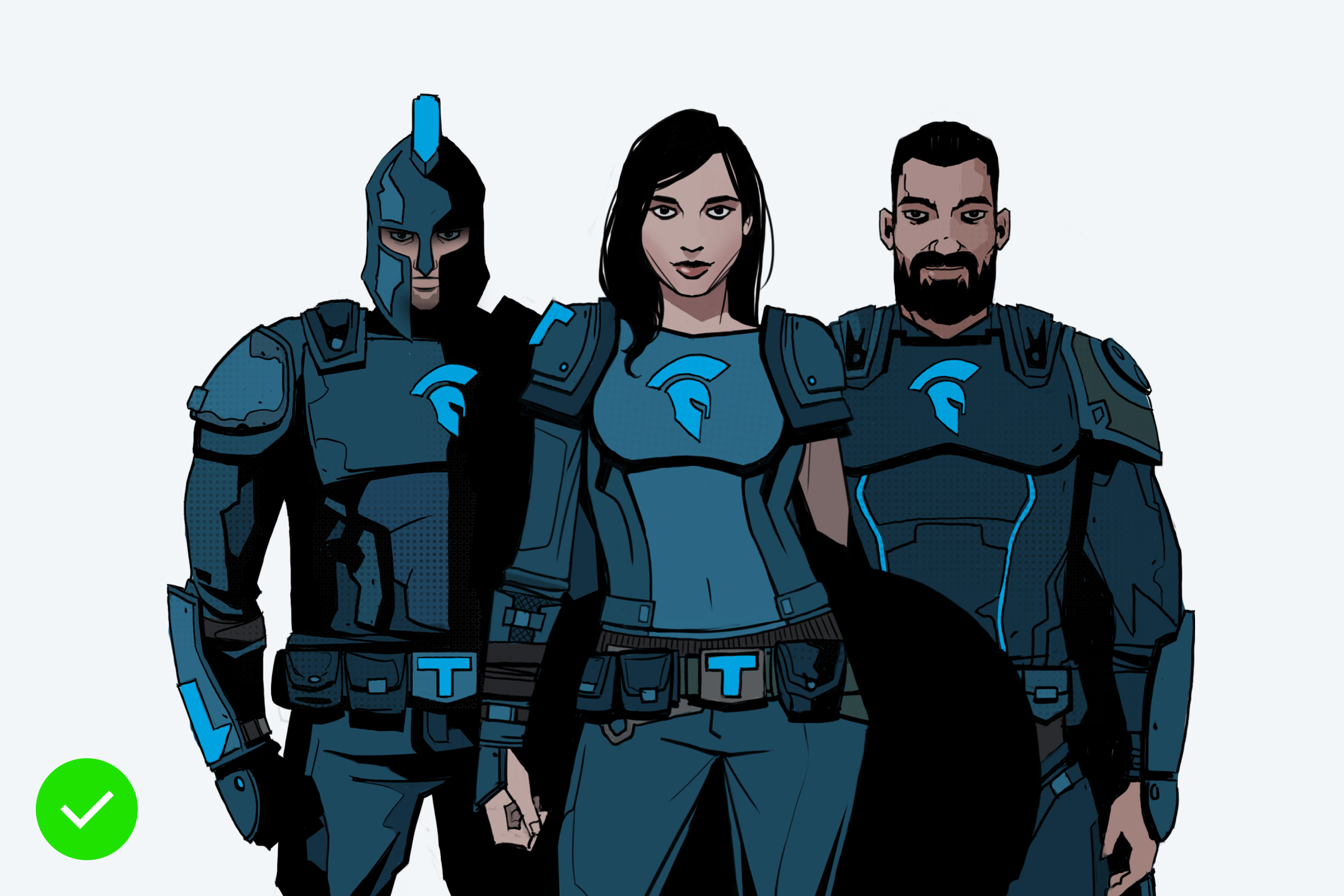
You can use light grey and white colour tones for backgrounds for comic characters.
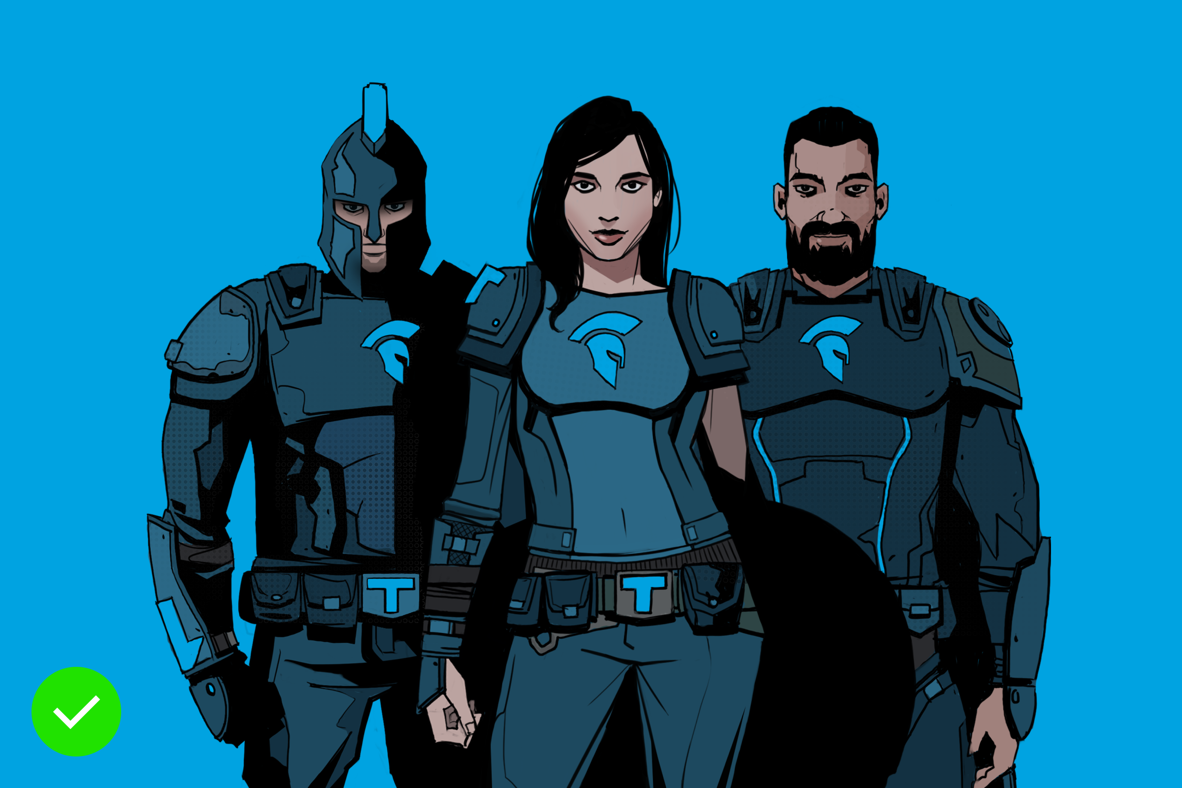
You can use primary colours for backgrounds for comic characters.

On characters details like TITANS icon always use Titans Blue to remain brand recognised.

Example: Using different shade on characters contrast elements is prohibited.

Example: Always highlight important details of characters with Titans Blue
Updated 2023/04/17
Our visual style varies depending on the message structure, audience and tone of voice.
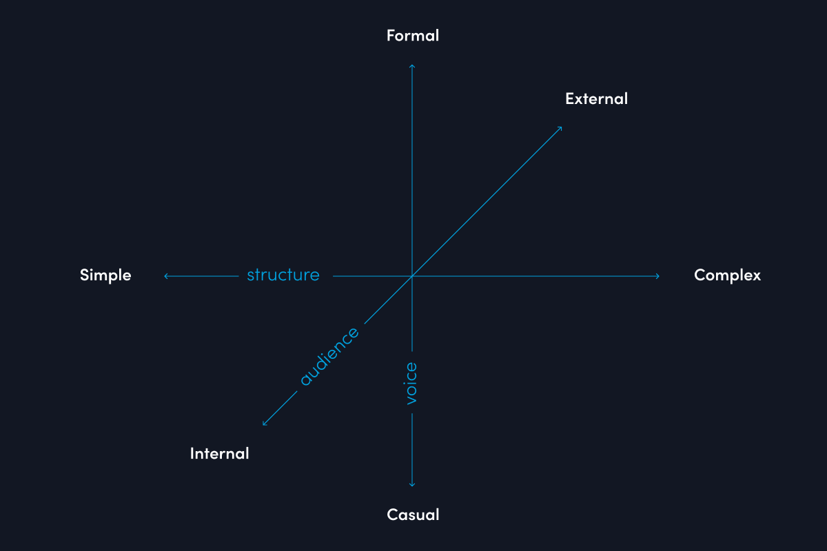
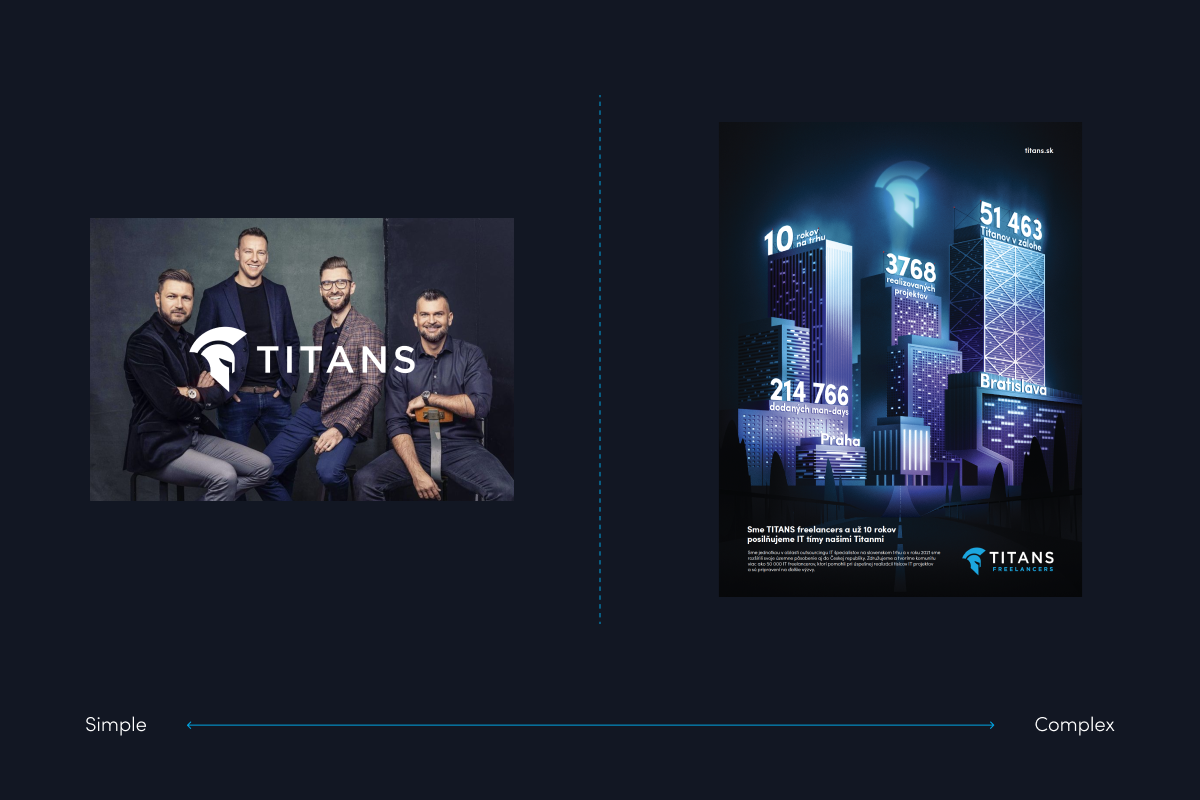
Structured communication needs more elements. Ask yourself: What do we need to communicate?
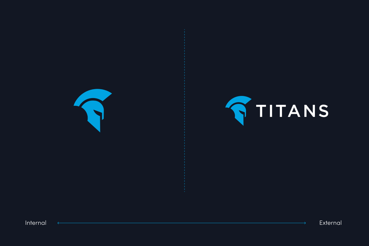
Who are we communicating with? Do we talk to people from our company or to potential clients? Some people know us, others don’t, we need to take it into consideration in our communication.
How are we communicating with businesses or individuals? With what kind of individuals do we communicate? We need to adjust our tone of voice to be more approachable for specific audience.

Updated 2023/05/23
In this section you can see how to apply your brand on different media.

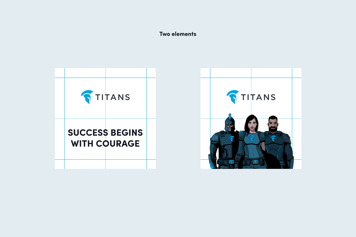
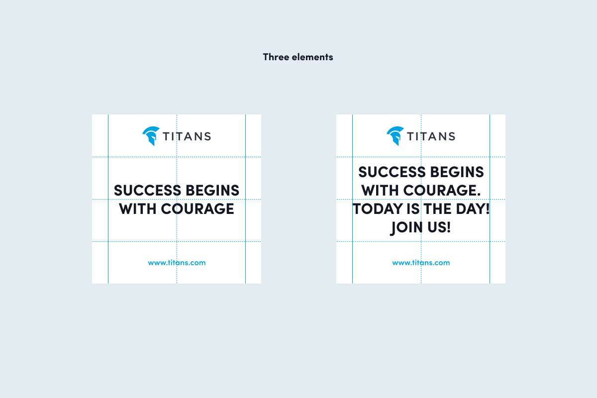
As a basis, we place design elements with the help of halves and thirds of specific formats.

Halves are used for simple compositions – like placing one or two design elements.
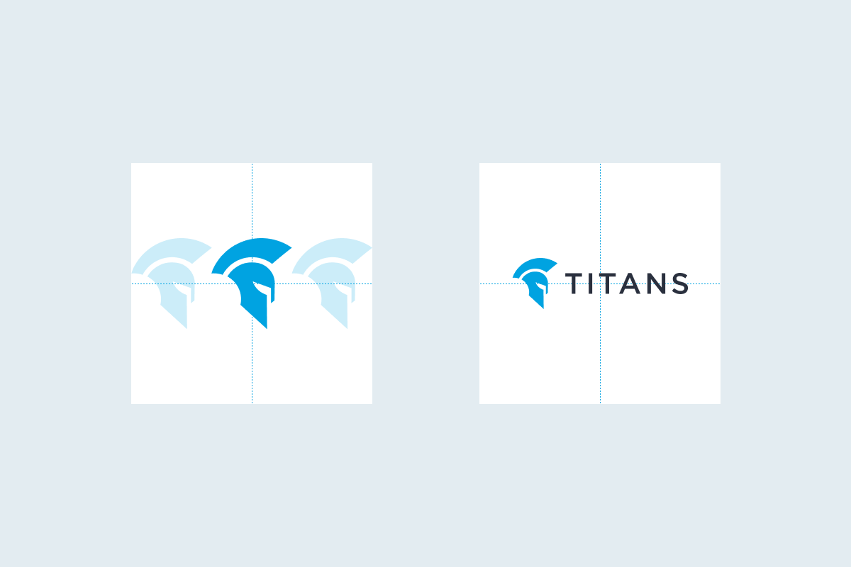
We use three types of margins. Basic margins are used on most of our design compositions. Small margins are used for more structured content (i.e. instagram/linkedin carousel posts with a lot of content).
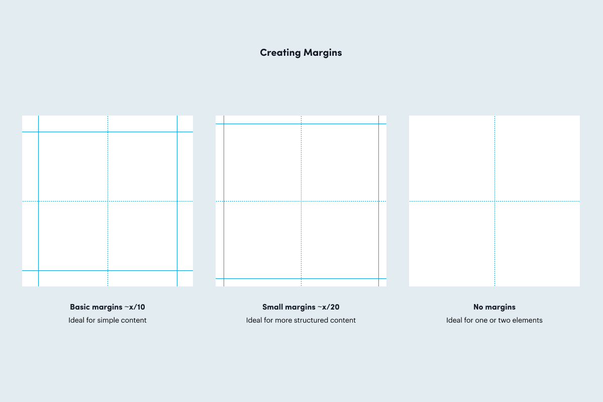
Preview of elements placement with the use of gridlines.
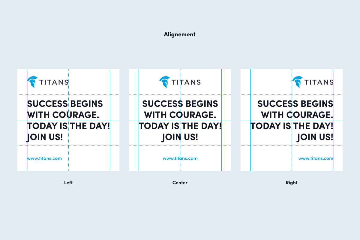
Primarily, we align content to the left or in the centre. In exceptional cases we can also align to the right.
We use TITANS Cut as visual element and as a connector between the world of TITANS (comic) and the world of humans. We can also use it when working with photography.
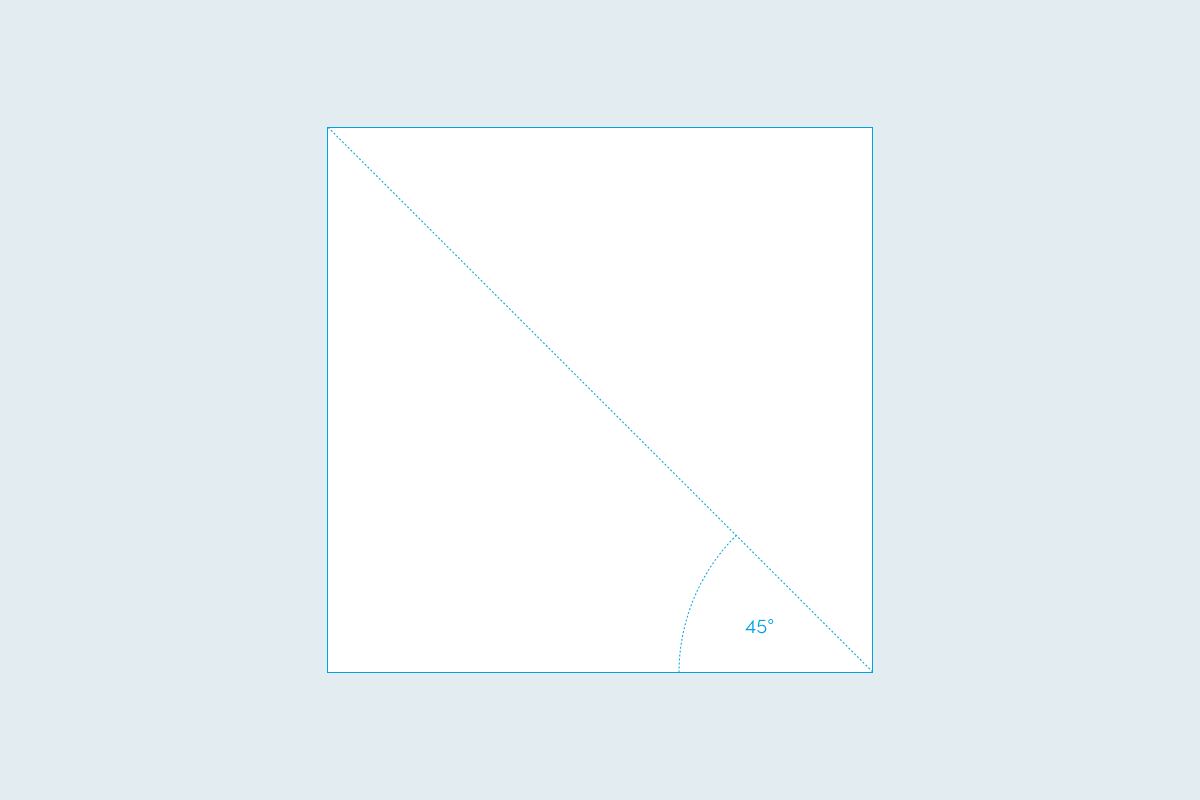
TITANS Cut could be used in situations where we need to connect the real world and the comic world. It works like a window to the world of TITANS. It also works great in situations where we need to apply background only on a part of the design or in situations when we do not have background in adequate resolution or size. By default, we place the Cut in the bottom left corner. We can also move or reposition the shape according to different situations. The Cut can also be used inversely where we can mask our composition. The use of two shapes creates the so-called edge. The Cut is also used to mask the photo and create the illusion of space.
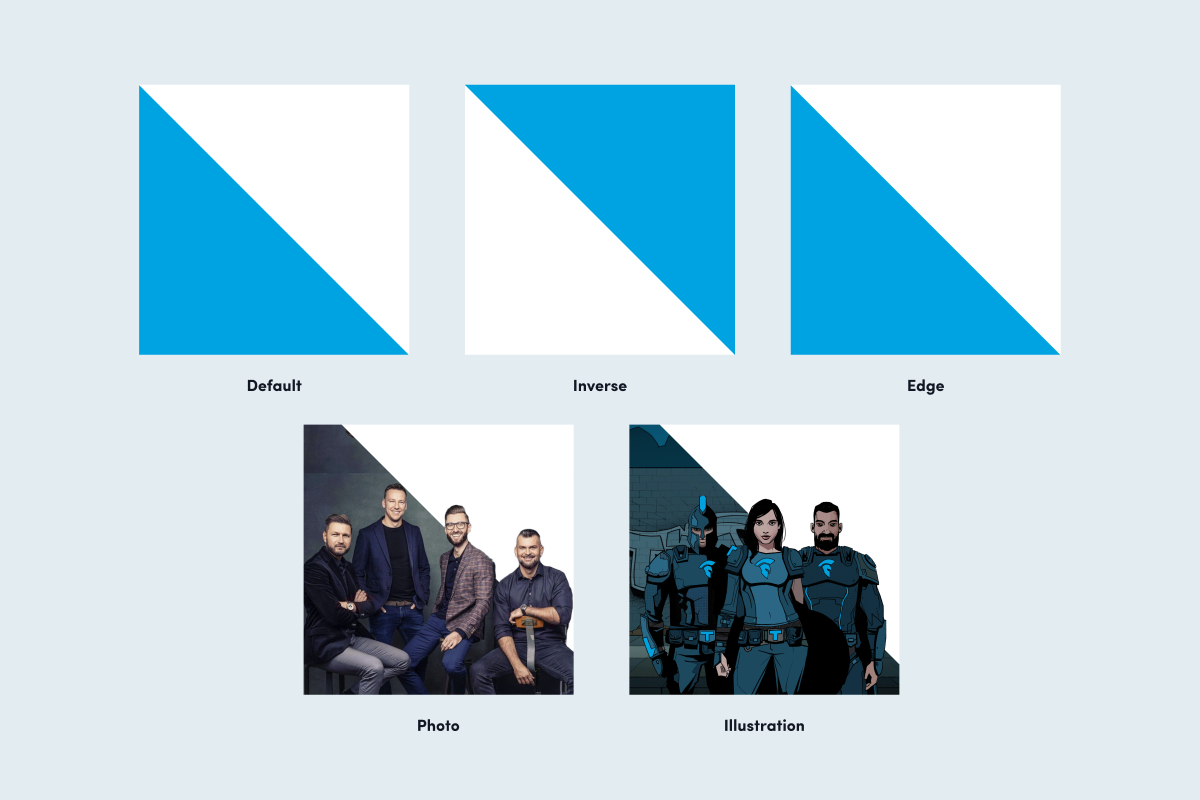
TITANS Cut can be used as a background for comic characters.
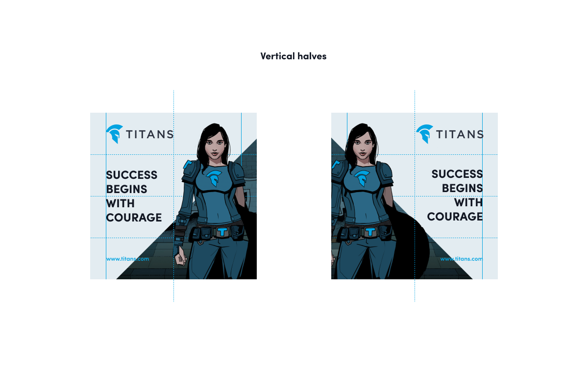
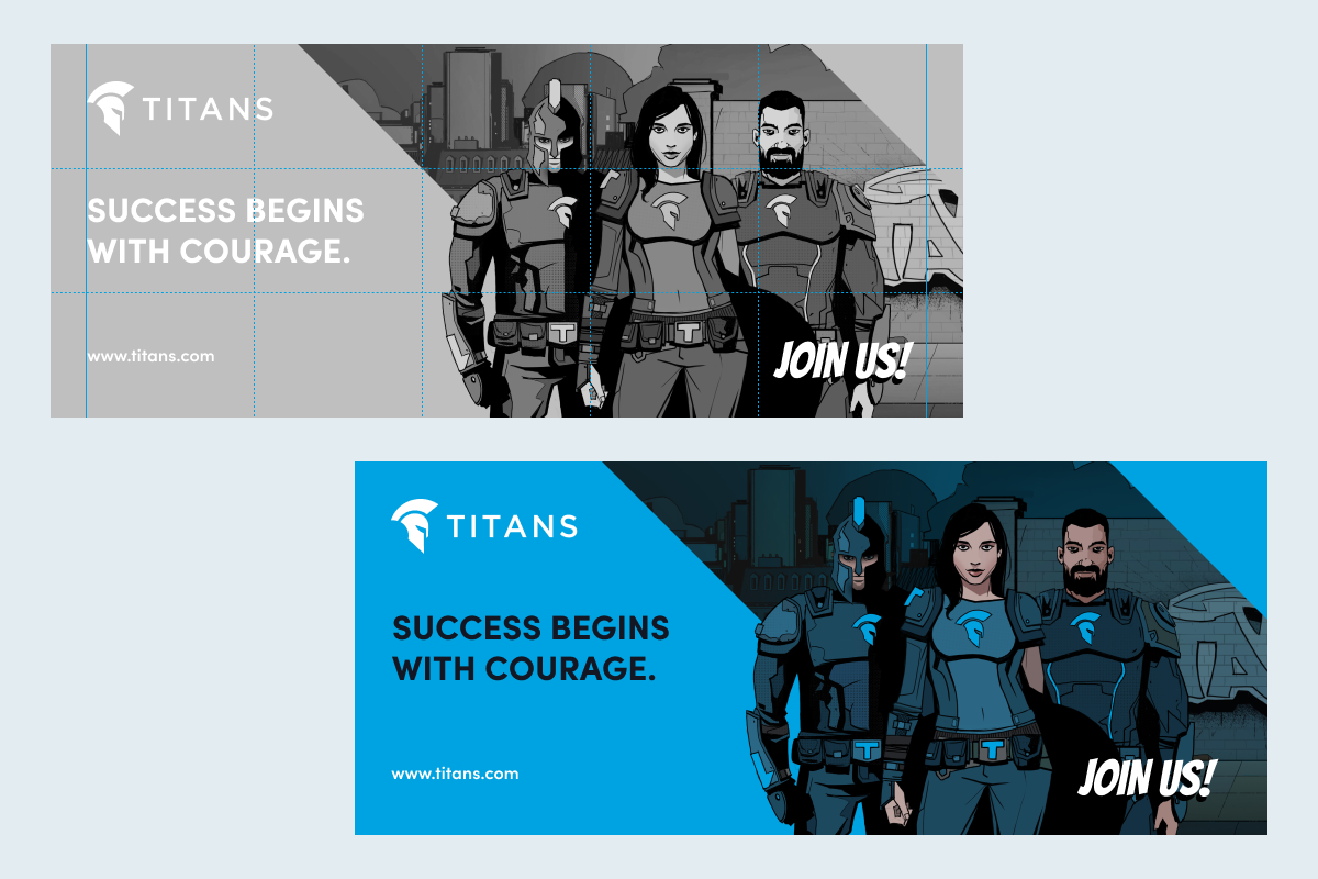
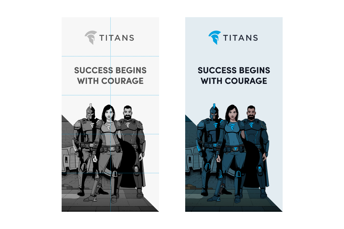
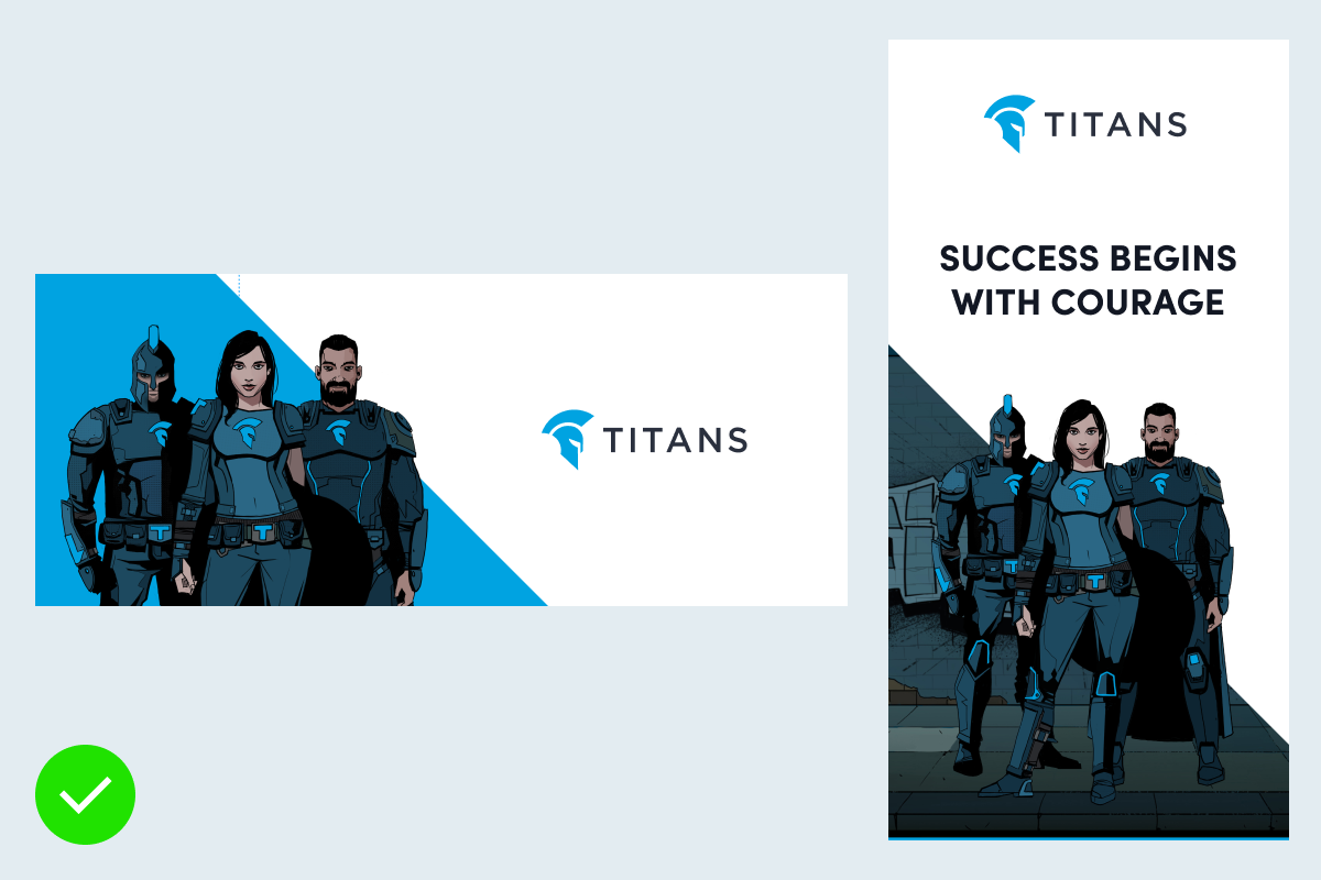
We can use TITANS Cut in solid colour or with comic background
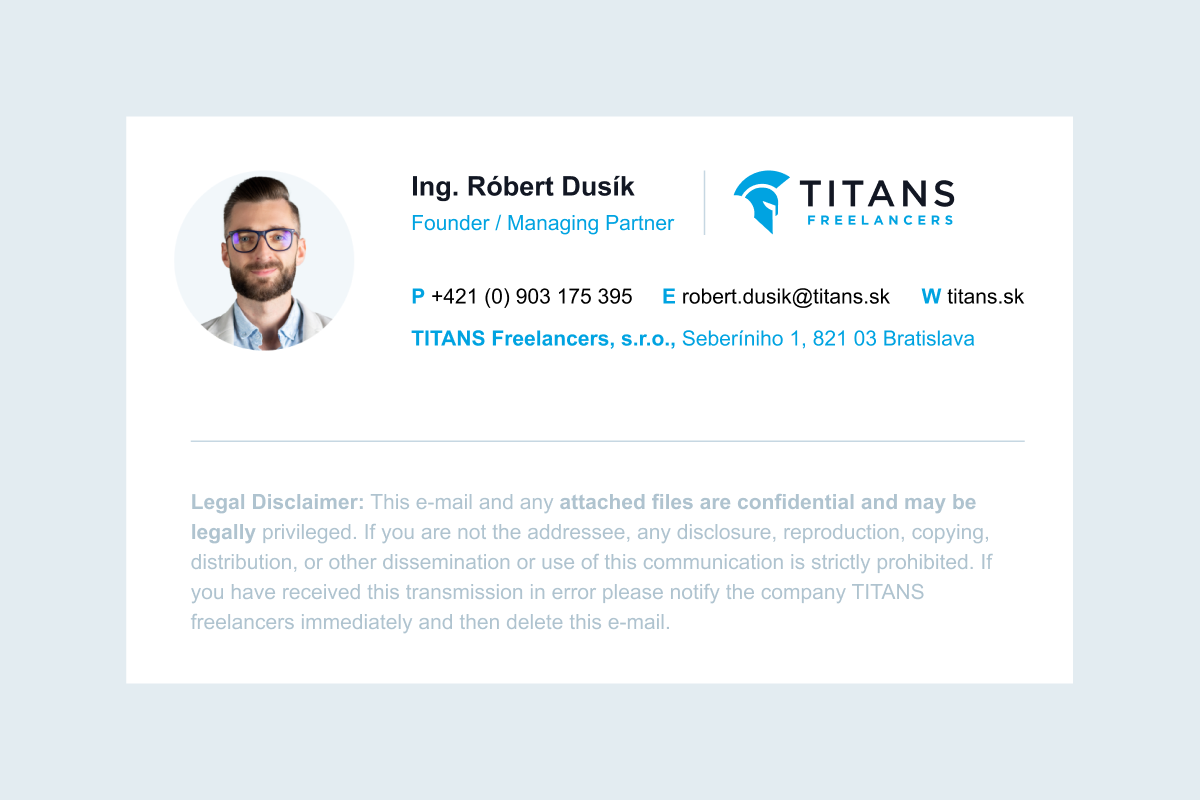
Version 1: Email signature with a photo
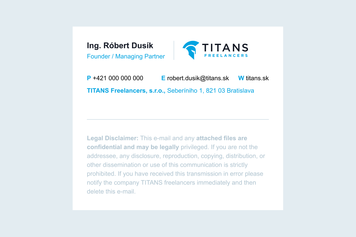
Version 2: Email signature without a photo

Version 3: Email signature with an icon
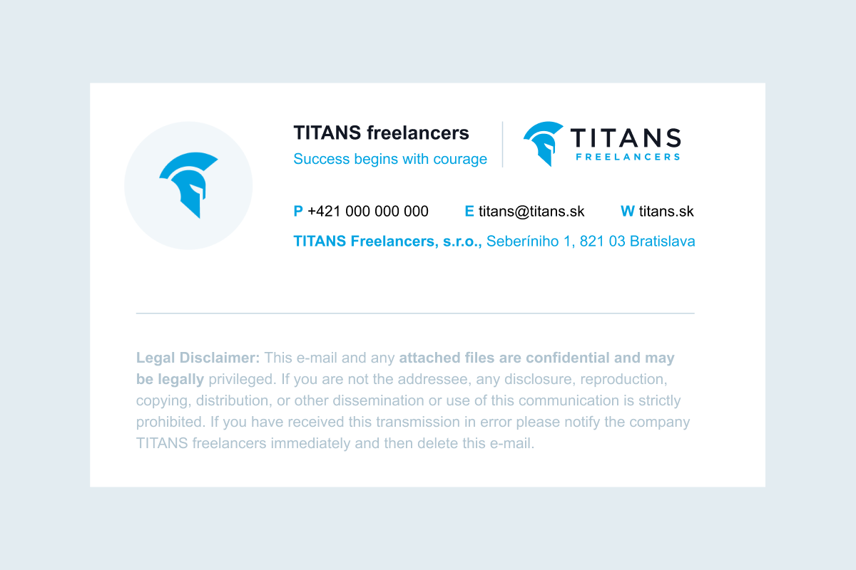
Version 4: Email signature with an icon and full logo
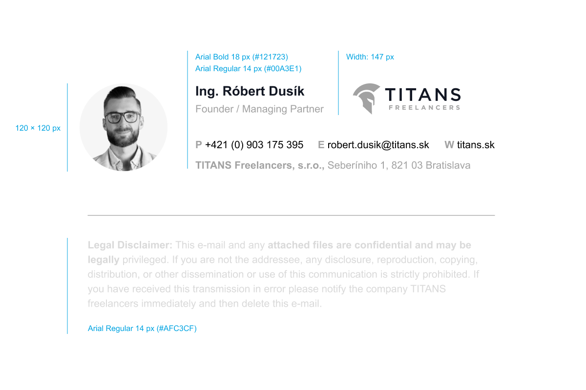
Updated 2023/05/23

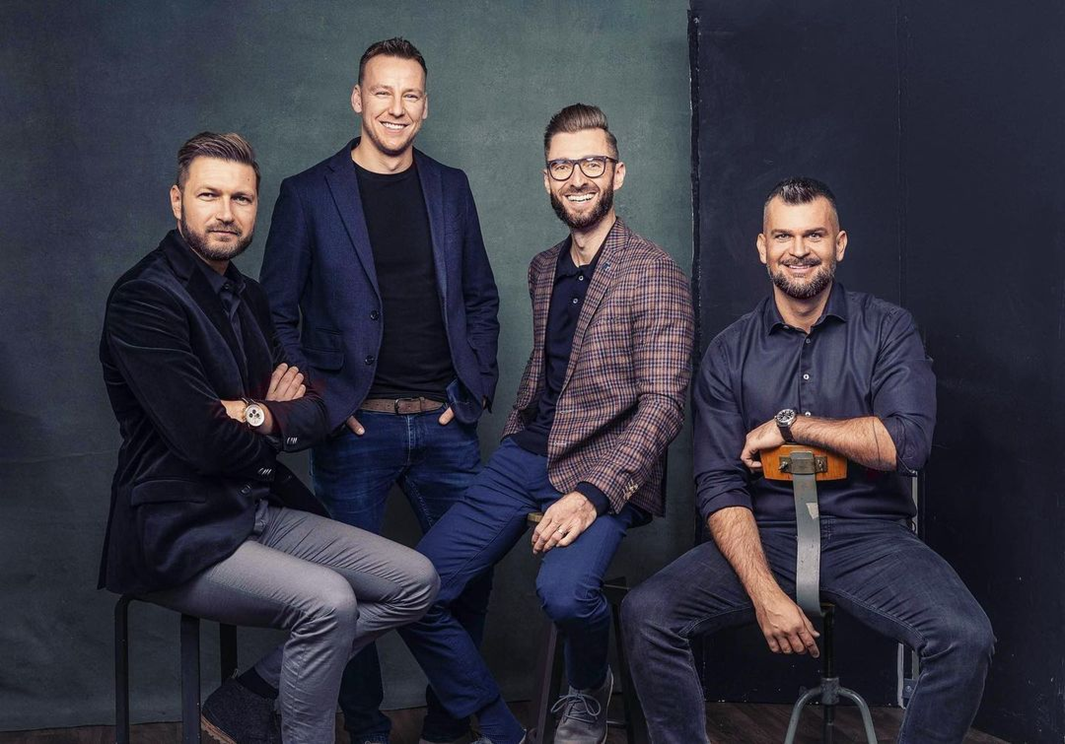
We want to connect our human world with the comic world of TITANS to communicate adventure and fun awaiting every IT professional. The people we depict are enjoying their lives using their IT superpowers.
Updated 2024/05/23